Pages

Showing posts with label branding. Show all posts

Saturday, 4 April 2015

Love Japan Magazine: Issue #1

You may remember at the end of last year, during my Christmas break, I spent some time working on the branding for a new Japan-themed magazine – Love Japan Magazine. Well, Issue #1 is now out there and it’s awesome!

I didn’t have too much involvement in the actual layout of the magazine… But I designed the patterns that are in use for backgrounds and page borders, as well as suggesting font combinations when I did the branding work. Plus, one of my photos is in there – see if you can find it. I have also made some overall typographical and editorial design tweaks to the final magazine – as an editorial designer in my day job (2.5 years and a middleweight designer now, by the way!), I thought I could put my skills and expertise to good use.

Emily has done an amazing job pulling everything together – not to mention coming up with the idea for a well-researched, well-written and well-designed Japan-themed magazine in the first place – and there are some excellent articles, photos and illustrations that have been contributed to the magazine from a wide range of people, all over the world.

I’m excited to say that, although I didn’t work on the design for the layout of this issue, I will be having more involvement in Issue #2. I’m meeting Emily to discuss things [over some Japanese tea] in London next weekend. So stay tuned for more details on #2! And for now… here is Issue #1:


Saturday, 3 January 2015

Love Japan magazine

I have been very much enjoying my almost-two-week-long Christmas break: relaxing, sleeping in, eating nice food, being at home with the parents and the cat, not driving around, not spending money and not working. Well, not my day job anyway. I have, however, been keeping creative both by making a start on the physical book version of my Japan (April, 2014) travel journal and with another Japan-themed project…

I have been working on the branding for Love Japan magazine, a new magazine for, you guessed it, fans of Japan.

I’ve been a bit magazine mad recently; writing for our college magazine, and researching fashion magazines for work I’ve been doing in and out of college, so I think this was the catalyst for Love Japan. I wanted this magazine to have the aesthetics of independent magazines that I’ve fallen in love with, whilst focusing on Japanese culture, travel, lifestyle, food and fashion. Issue #1 will be released in the Spring and I’ve got contributors from the UK, USA and Japan working on articles.
– via Emily, the brains behind Love Japan magazine (taken from her own blog post, here – which mentions me!)

The stand-alone logo graphic
A colour palette to be used throughout the magazine and website
Title typography for the front cover of the magazine

I also created a selection of patterns to be used within the magazine for backgrounds and/or borders, suggested how typography could be used and produced a sample design for the layout.

I can’t wait to see and read the first issue when it is released in the Spring!

Friday, 22 February 2013

The choughs are back

I’m rather excitied to be working on Cornwall Film Festival 2013, following on from my re-brand work with them last year. As yet I’ve only provided CFF with a series of profile pictures/avatars for use on Facebook/Twitter and a Facebook cover image… but there will be more soon.


Saturday, 13 October 2012

Oxfam re-brand

I probably ought to have blogged about this already, it seems Design Week did so at the beginning of September. I was aware of the Oxfam re-brand through the Oxfam newsletter a little while ago but failed to see any mention of it on design blogs when it was first unveiled.

However, I have now actually looked into it and am aware of which design agency actually did it – Wolff Olins. Yep, they were also responsible for the controversial London 2012 Olympics logo/brand.


Overall, I like it. It seems more current and appropriate, and it certainly makes sense for the charity to have one global identity. Although I could certainly point out a few good and bad things – my personal opinion of course.

I don't have a problem with the capitalisation of “Oxfam” in the logo, nor in the campaign materials – it seems like a fairly friendly font, as far as uppercase letters go (again, just what I think). Although I'm not entirely sure why Wolff Olins decided to remove the counters from some of the letters and not others. I guess the “O” could be seen to represent Oxfam but why take it out of an A and R but not P or D? But anyway, it's better than the Cooper Black they had before.


I like the colours, although some combinations work better than others. It’s good that not everything is Oxfam’s green but that it is still their colour. I also think the logo works particularly well when in white on the plain bold colours.

But really what’s important is that Oxfam’s purpose and message remains the same and that it doesn’t get clouded by bright colours and letters without counters.

“Wolff Olins helped Oxfam to define its role – what it offers to people around the world, as a global movement for change – and to talk about what it does in an optimistic yet uncompromising way, setting a vision for the future. We also brought to the surface its underlying character – being both practical and visionary.” – Wolff Olins

EDIT: Wait, why did they stick the word “NOW” over someone’s face?

So, Tooze and I could probably have done it for a hell of a lot less than what Wolff Olins charged but then could we have done as good a job? No.

Friday, 29 June 2012

Cornwall Film Festival re-brand reality

Cornwall Film Festival approached the UCF graphic design course earlier this year wanting to give their brand a re-fresh. I was one of four students who created complete re-design proposals and it was my designs that they picked to be developed further.

I met with Tiffany, the director of the film festival, and Martin Nixon of Nixon Design on Monday this week. They both gave some great positive feedback which enabled me to put finishing touches to my design and send it all off, a couple of days later, ready to be used for real. With any luck, something will be going to the printers soon.

So, meet the new Cornwall Film Festival chough:


Sunday, 29 April 2012

Cornwall Film Festival

I've updated my website with my proposal for a re-design/re-fresh of Cornwall Film Festival. I've also added a page for my major project, Tall Tales & Short Stories, but that's only got a description of the project on it for now! Go look!


Wednesday, 4 May 2011

Coworth Park

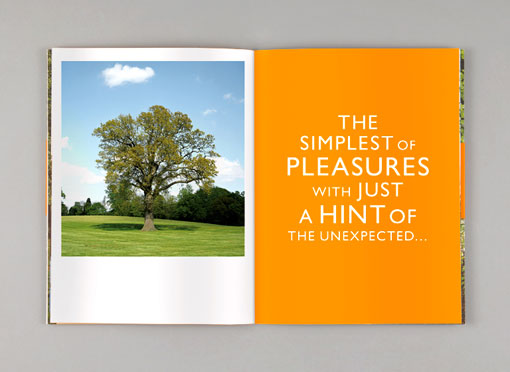
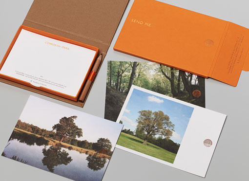
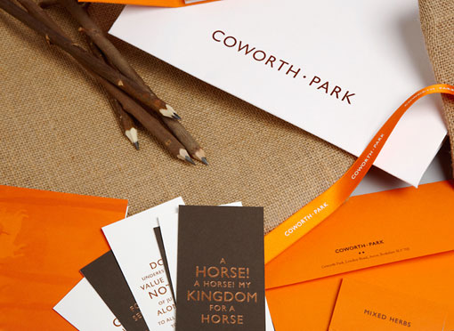
As the author of this post states, over on design.work.life, there is a lot more to this brand than this one image. But tree + type is just beautiful.


Okay then, I'll throw in a few more images...


Designed by &Smith

Wood grain

Does this look like wood grain?


Because that's what it is meant to be...

Saturday, 15 January 2011

Asha: Guest lecture

Yesterday we had a brilliant and inspiring guest lecture - Mark Steen from Asha, a "London design studio, outside of London." (Cheltenham). They have worked on a wide variety of projects, big and small, which you can check out on the website. But the project that really stood out for me was their 'brand refresh of' WWF.


"The world’s leading conservation organisation have been working with ArthurSteenHorneAdamson in a global brand refresh, aiming to clarify the public's understanding of the breadth of its work."

WWF is a worldwide known environmental organisation with its iconic panda logo. But the panda was all it was know for, "Noone really knows what it [WWF] is for." Which is where Asha came in.


One of the key things that Mark kept stressing was the importance in separating the science and emotion - science being the facts and figures, and emotion - the cute cuddly toy animals. And it's the sciencey side that I really liked, how the facts and figures are displayed so clean and simply.


"WWF is a science-led organisation, but it is important to recognise that the emotional aspect of what they do helps them to engage with a wider audience. To ensure their science-led approach is given appropriate emphasis, and to enable WWF audiences to understand and engage with the science quickly, ASHA developed a signature style for portraying scientific information."


Asha even designed a new condensed typeface specifically for WWF.


Really great stuff. The sort of thing I'd like to be a part of, something meaningful - science, environmental, geography, information etc.

Tuesday, 9 November 2010

Moodboard workshop

I've had a branding moodboard workshop, literally, all day today ('til 5pm). Working in groups, looking through magazines for images to represent the product/company we had been given. My group had a pharmacy, Pharmacare.

The best part was simply finding this brilliant illustration in one of the magazines:


Monday, 8 November 2010

Bruce Mau's manifesto For Growth

We were told in this mornings lecture/presentation to look up Bruce Mau's manifesto, as we have to compile a short, 5 point manifesto of our own. I've just been reading through it and there are some excellent points in it, many infact. I will list a few here, but here's the full manifesto.


Written in 1998, the Incomplete Manifesto is an articulation of statements exemplifying Bruce Mau’s beliefs, strategies and motivations. Collectively, they are how we approach every project.

Incomplete Manifesto for Growth

2. Forget about good.
Good is a known quantity. Good is what we all agree on. Growth is not necessarily good. Growth is an exploration of unlit recesses that may or may not yield to our research. As long as you stick to good you'll never have real growth.

3. Process is more important than outcome.
When the outcome drives the process we will only ever go to where we've already been. If process drives outcome we may not know where we’re going, but we will know we want to be there.

7. Study.
A studio is a place of study. Use the necessity of production as an excuse to study. Everyone will benefit.

9. Begin anywhere.
John Cage tells us that not knowing where to begin is a common form of paralysis. His advice: begin anywhere.

14. Don’t be cool.
Cool is conservative fear dressed in black. Free yourself from limits
of this sort.

17. ____________________.
Intentionally left blank. Allow space for the ideas you haven’t had yet, and for the ideas of others.

18. Stay up late.
Strange things happen when you’ve gone too far, been up too long, worked too hard, and you're separated from the rest of the world.

20. Be careful to take risks.
Time is genetic. Today is the child of yesterday and the parent of tomorrow. The work you produce today will create your future.

29. Think with your mind.
Forget technology. Creativity is not device-dependent.

33. Take field trips.
The bandwidth of the world is greater than that of your TV set, or the Internet, or even a totally immersive, interactive, dynamically rendered, object-oriented, real-time, computer graphic–simulated environment.

41. Laugh.
People visiting the studio often comment on how much we laugh. Since I've become aware of this, I use it as a barometer of how comfortably we are expressing ourselves.

42. Remember.
Growth is only possible as a product of history. Without memory, innovation is merely novelty. History gives growth a direction. But a memory is never perfect. Every memory is a degraded or composite image of a previous moment or event. That’s what makes us aware of its quality as a past and not a present. It means that every memory is new, a partial construct different from its source, and, as such, a potential for growth itself.